
Summer Health: Care App
In June 2022, I joined Summer Health as their founding designer. The company was five people, the product was an SMS-based pediatric care service, and there was no design practice to speak of.
Over the next three and a half years, I built the entire design function from zero, eventually becoming Head of Design as the company grew to around twenty people, raised its Series A on a pitch deck I designed, and expanded from urgent care into everyday pediatric care.
The work split into two big design problems: building parent trust through asynchronous text, and figuring out how AI should (and shouldn't) show up in healthcare.
Two years of text messages
Summer Health launched as an SMS service. Parents signed up, added their child's details, and messaged a number whenever they had a question. A pediatrician replied. It worked on the phone already in their hand, with almost no learning curve.
From a product design perspective, SMS was brutally limiting. The surface area was tiny: no components to design, no flows to optimize, no interface to refine. But from a parent's perspective, it was exactly right. Low friction. Worked in areas with poor data coverage. Parents loved not having to download another app during a moment of worry about their child.
That tension (limited as a design surface, but exactly what parents wanted) defined the first two years and shaped everything that came after.
“A deeply empathetic product builder.”
Anton is a world-class designer; he is talented with user experience and visual design, and a deeply empathetic product builder.
He is a team player in every way—he gets involved with the team and customers to understand and embody the brand.
It was a privilege to work alongside him to advance our mission to raise the healthiest generation.

Ellen DaSilva
CEO, Summer Health
Constraints worth naming
Before getting into how we designed the Care App, it helps to understand what we were designing within.
- HIPAA compliance governed every decision. Healthcare data demands a level of care that limits what you can do with notifications, data display, and third-party integrations. Every design choice had to pass through that filter.
- Async by nature. This wasn't a video call or a chat with a bot. Parents sent messages when their child was sick, often at night, often stressed, and clinicians responded as quickly as they could. Building trust through text alone is hard enough. Building trust through asynchronous text, where a worried parent sends a message and waits, demanded that every piece of the experience worked to close that gap.
- Parents in distress. Our users weren't browsing. They were worried about their kid. The emotional register of every interaction had to acknowledge that without adding friction.
- Clinician burnout. On the other side of every conversation was a pediatrician managing dozens of cases. We couldn't optimize for parents at the expense of providers. Both sides had to work.
- Design team of one. I was the only designer throughout, from founding designer to Head of Design, so the same desk handled every screen, flow, research call, and brand asset.
Listening before designing
I ran roughly fifty 1:1 research calls with parents over my time at Summer Health. Not a one-time sprint, but an ongoing practice that shaped the product continuously. I also ran informal sessions with providers, adapting my approach for a different audience.
What I heard changed how I thought about the problem. One parent told me: "Prior to Summer Health, I would always wait until my children showed obvious symptoms. Now I can use Summer Health for early triage." The product wasn't just answering questions. It was shifting behavior from reactive to proactive.
Another finding I hadn't anticipated: Black and Hispanic parents described feeling safer communicating through text because it removed dynamics they experienced in in-person visits. "Going to my pediatrician, I often feel fearful of being gaslit, being misdiagnosed, and having my symptoms dismissed." What started as a business decision (SMS is cheap and simple to build) turned out to have equity implications we hadn't designed for but needed to protect.
A third parent captured the core value better than any brief I'd written: "I love how Summer Health is action-oriented versus having to wait until the situation gets worse. It's comforting, easy, and fast." She literally used the language of one of our design principles, action-oriented, without ever having seen them.
From SMS to native app
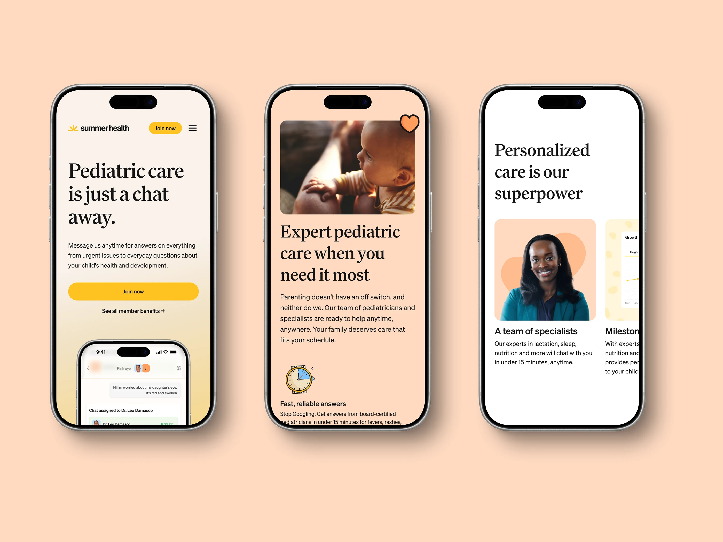
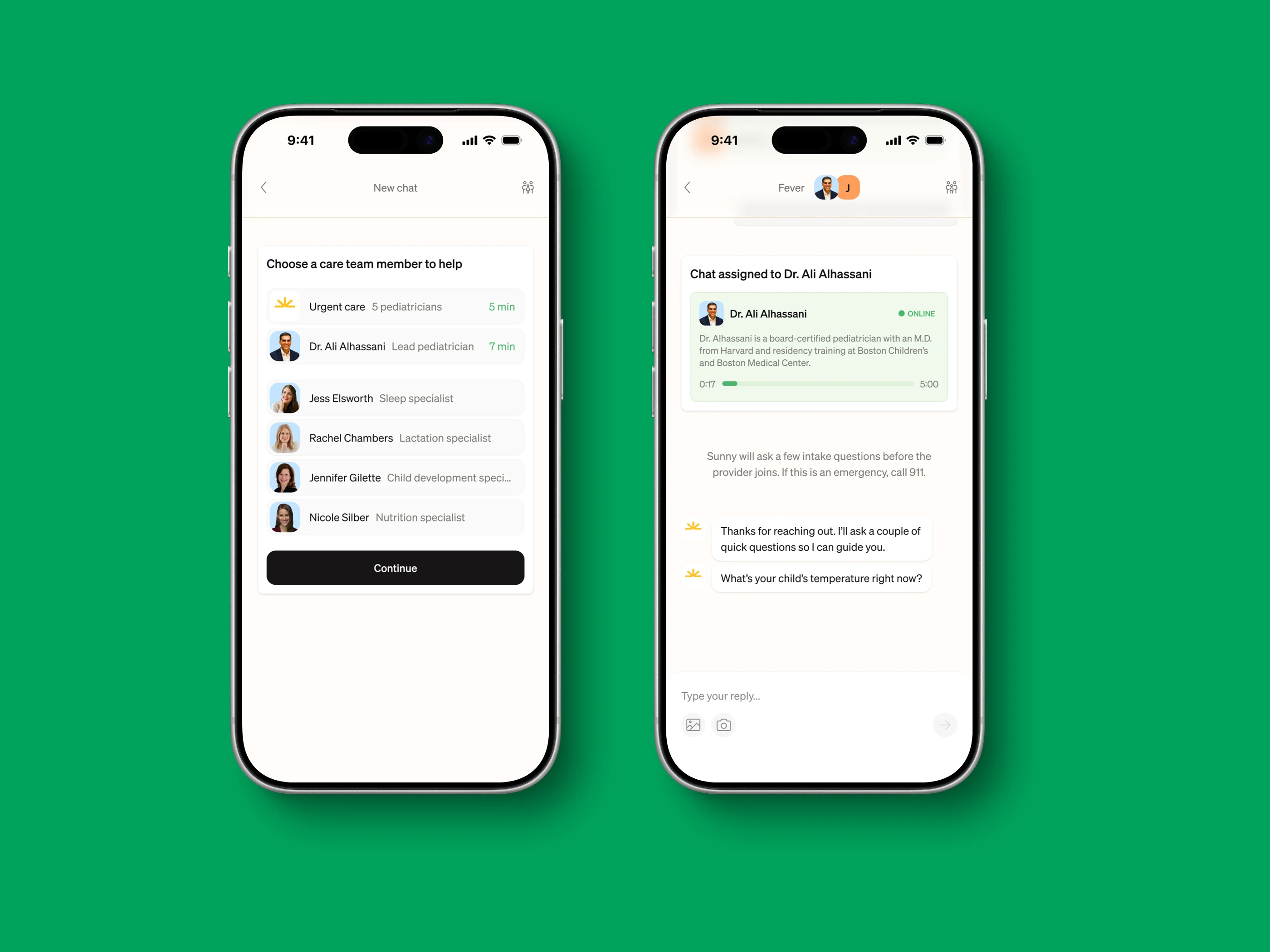
After two years, we'd outgrown what SMS could do. The service needed richer intake, better continuity between visits, and a proper home for a family's health history. I led the transition to a native app alongside Matthew, our CPO, with daily contact across the nine-hour time difference.
The design principles that guided the app weren't invented in a workshop. They emerged from research and accumulated over two years of working within SMS constraints: simple but warm, default helpful, action-oriented, trust and credible, deeply personal, human connection. Six principles that shaped everything from which features to build to how the last line of copy read.
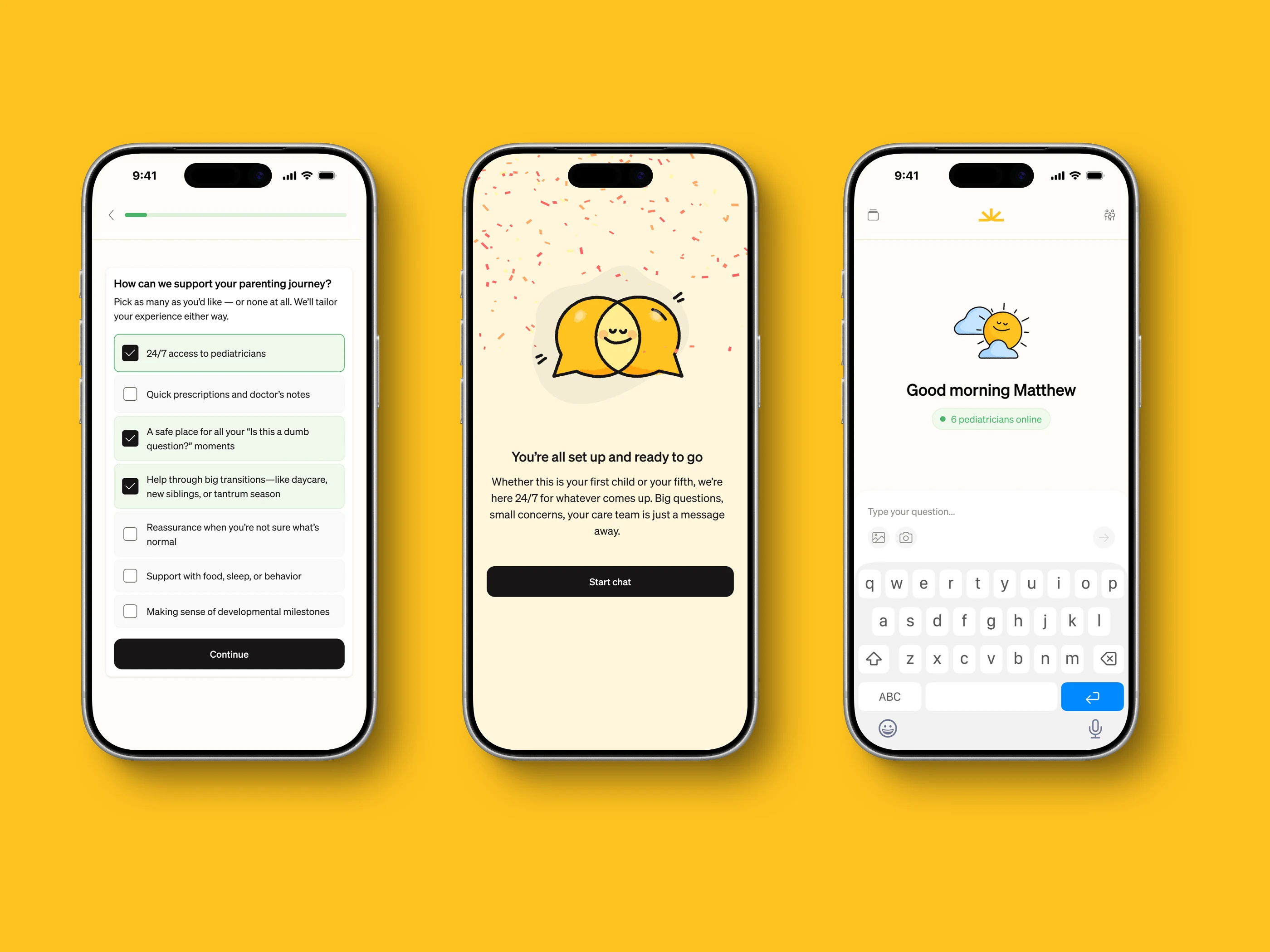
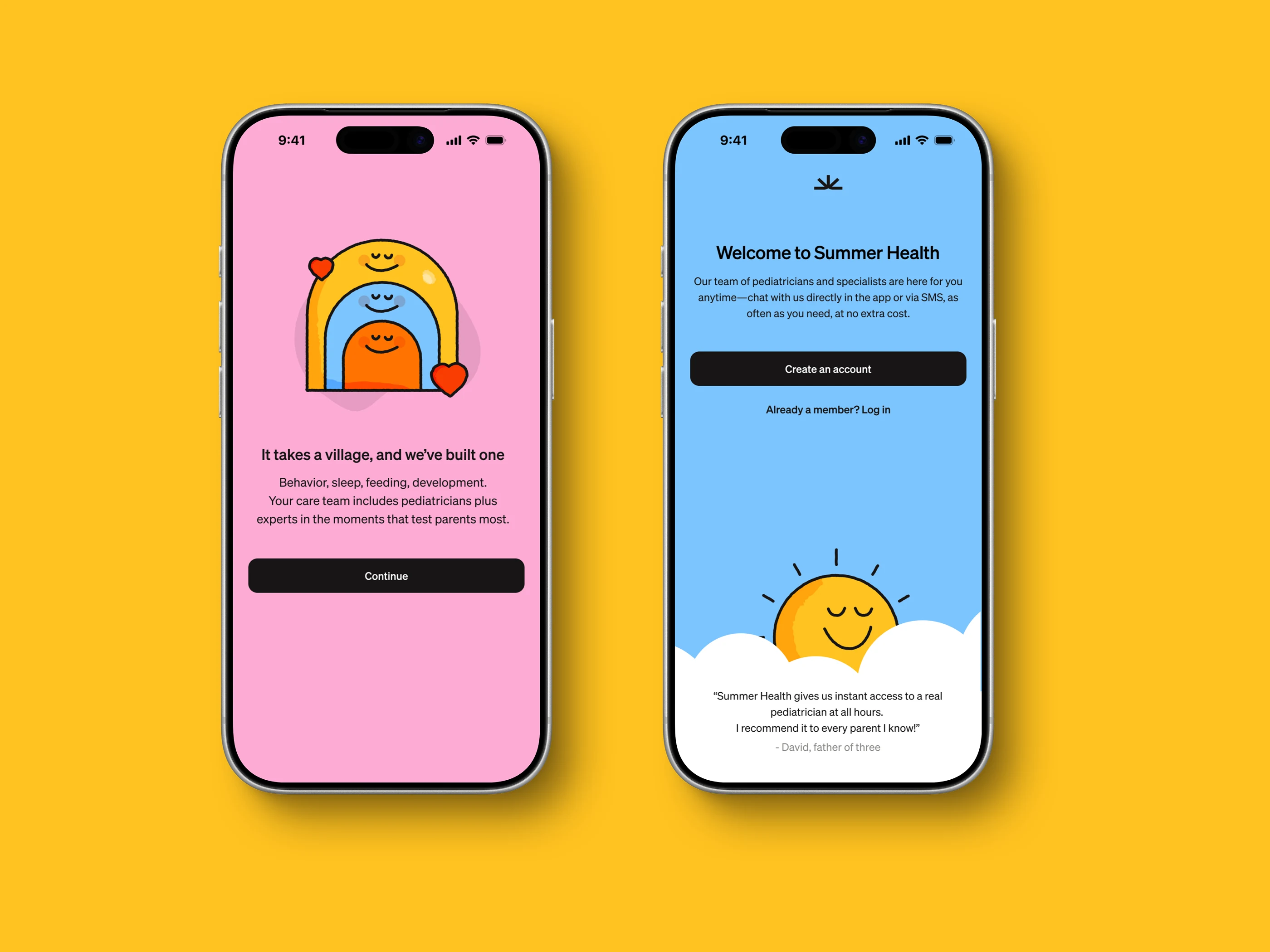
The Care App kept the conversational model at its core (text-based, async, human) but wrapped it in an experience that SMS couldn't support. AI-driven intake that helped providers get up to speed faster. Medical records for each child. A home for the family's health history that didn't disappear into a message thread.
AI that disappears
Summer Health uses AI, but in the Care App, parents never see it. That's by design, and the exact inverse of how AI shows up in CareOS, the clinician tool.
The AI works behind the scenes, helping clinicians draft responses faster, surfacing relevant context from previous conversations, and accelerating documentation. From a parent's perspective, nothing changes. They're still talking to a real pediatrician who knows their child.
This was a deliberate choice. Parents come to Summer Health because they trust the human on the other end. Introducing visible AI into that relationship, even helpful AI, risks undermining the thing that makes the service work. The principle was simple: AI should make clinicians faster without making parents feel like they're talking to a machine.
Brand and marketing
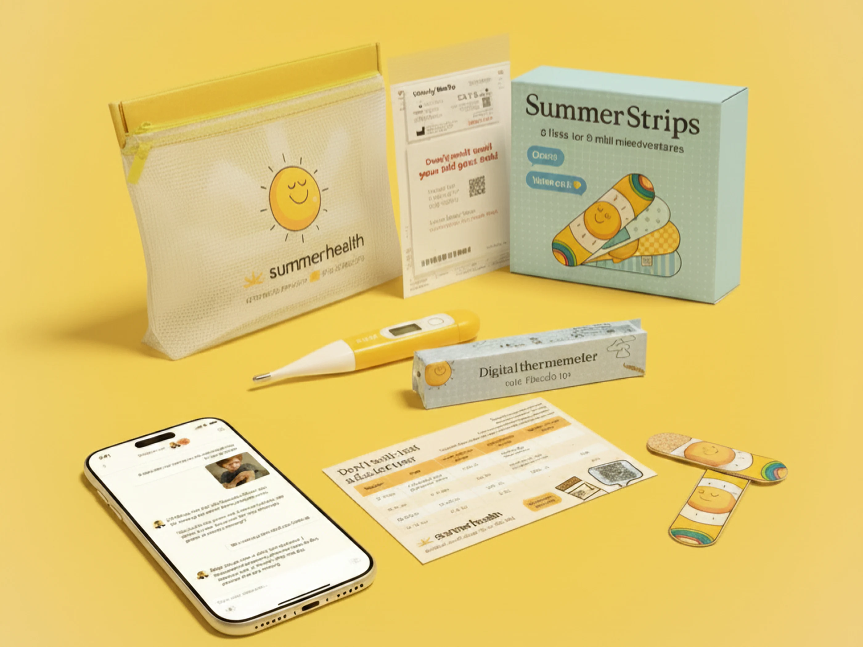
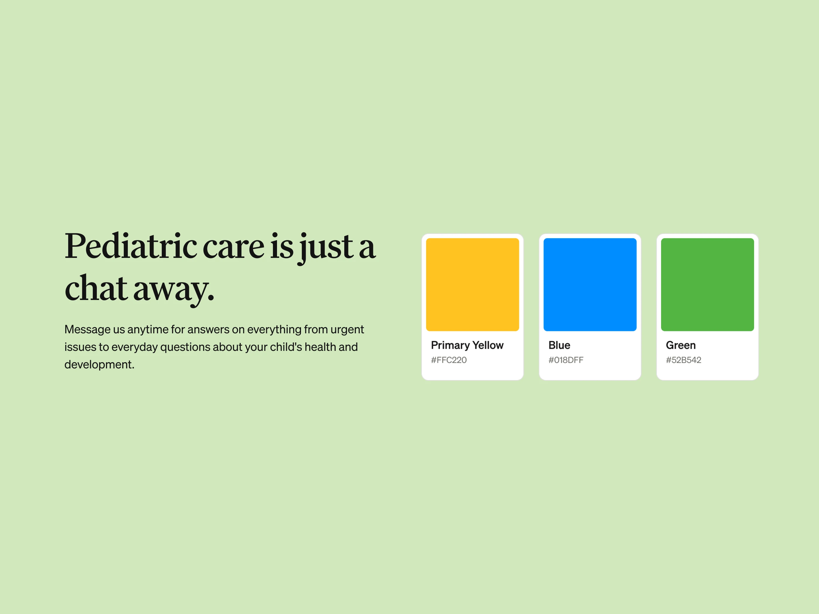
As Head of Design, my scope extended beyond the product. I shaped Summer Health's visual identity, directed sales campaigns, and designed marketing materials, bringing in specialists when the work called for it.
Tim Gilligan created the illustrations that gave Summer Health its warmth. He's a brilliant illustrator in a way I'm not. Celia Vera handled marketing design execution with a consistency I couldn't have maintained alongside product work. Aaron Rolston, one of the best Framer developers I've worked with, built all of our websites.
Knowing when to bring in the right specialist, and giving them clear direction, was as much a part of the design leadership as the hands-on work.
Outcomes
- 4-minute average response time from a real pediatrician, any time of day.
- 15,000+ families served through the platform.
- 4.7+ CSAT score maintained consistently across the service.
- "Summer Health is like crack for new parents" (Acquired, the podcast).
“An outstanding, truly insightful designer.”
At our best, we were a subscription business with 87% month-over-month retention—despite having a bare bones SMS product.
It takes an outstanding designer to use minimal surface area to deliver something both good and simple. Anton is that designer.
I'm grateful for his design leadership, his 10/10 fucks given commitment to exceptional UX, and his infallible eye for good design.

Lipsa Panda
Head of Data, Summer Health
The other side of the conversation
Everything in the Care App was designed around the parent's experience. But every message a parent sends lands on a clinician's screen, and when I arrived at Summer Health, the tool those clinicians used was failing them. That's the CareOS story.