Summer Health: CareOS
Rebuilding the clinical tool that powers pediatric care
For the first two years at Summer Health, my focus was the parent experience: the SMS service, the brand, the research that shaped how we thought about pediatric care. But every message a parent sent landed on a clinician's screen, and the tools those clinicians used weren't designed for them.
Every EHR they'd ever used made their job harder. CareOS was our chance to build something that didn't.


The problem with every EHR
Ask any pediatrician about their EHR and you'll hear the same thing. The tools they rely on every day were built by engineers, shaped by technical architecture, and optimized for compliance. Not care.
Features get added because someone could, not because clinicians needed them. Interfaces are cluttered, inconsistent, and mentally exhausting. Clinicians learn workarounds because they have no choice. Documentation on most platforms takes so long that it eats into the time meant for patients.
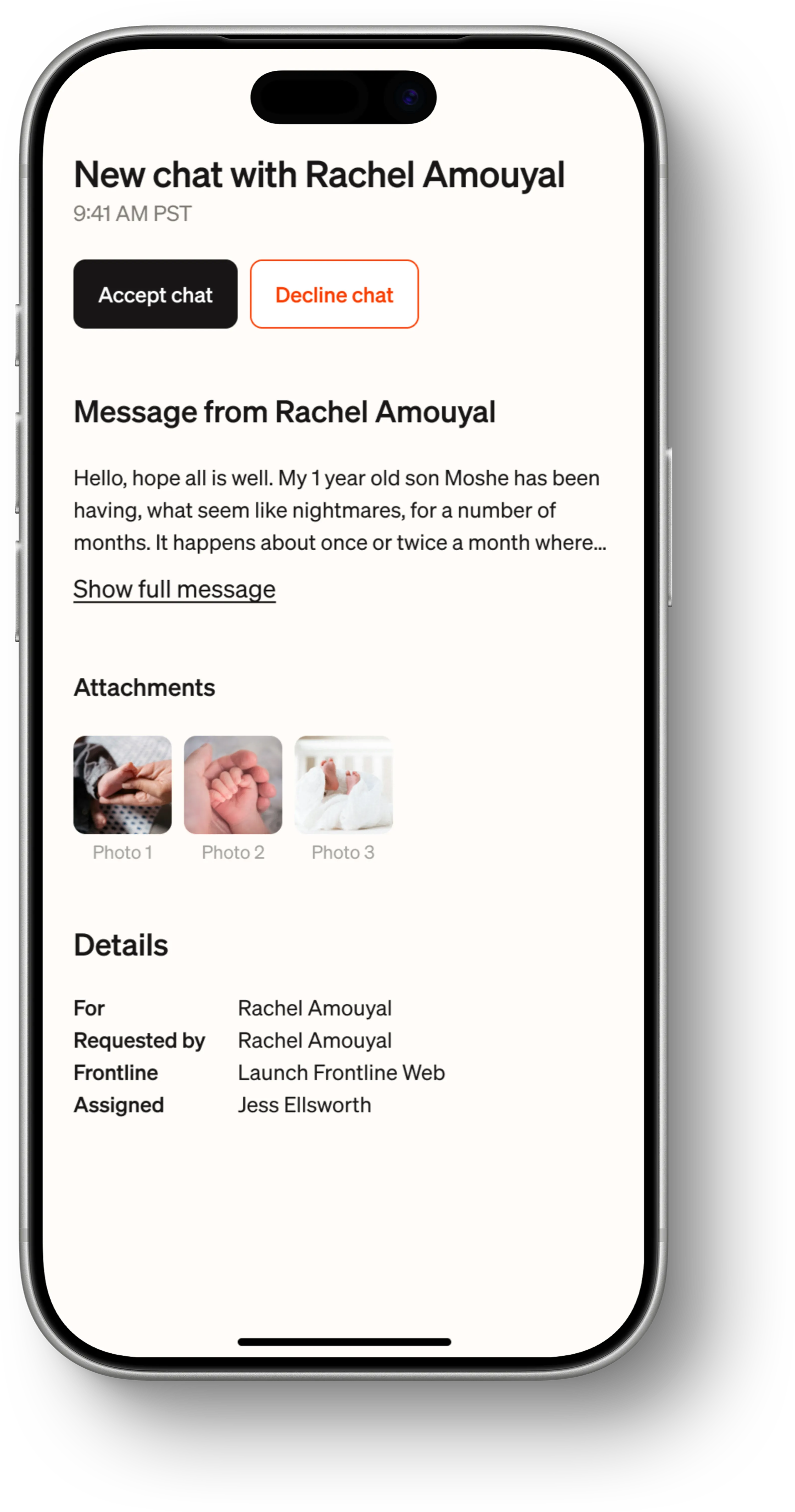
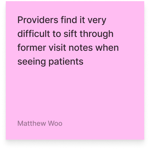
Summer Health's internal tool had the same DNA. The most telling example: the patient userID was displayed prominently throughout the interface. One of the first things a clinician saw when opening a case. Why? Because it helped engineers troubleshoot errors. But clinicians never relied on it, never referenced it, and it took up space that could have shown something they actually needed.
This wasn't incompetence. It was the wrong mental model. The tool had been designed from the perspective of the people who built it, not the people who used it eight hours a day.
"Anton is redefining what it means to be a modern design leader. His impact is felt across the entire product. I'm always looking for reasons to work with him again."
Constraints
CareOS operated within the same HIPAA requirements and async communication model as the Care App. But the clinical side introduced its own challenges.
- Provider workflows vary. Pediatricians, nurse practitioners, and specialists each approach cases differently. The tool had to be flexible enough to support varying workflows without becoming a blank canvas that required configuration.
- Speed is clinical. When a clinician is managing dozens of active cases, every extra click is time taken from a patient. The interface had to minimize friction not as a design preference but as a care quality issue.
- Trust in data. Clinicians make decisions based on what the tool shows them. If the information architecture is wrong, if something important is buried or something irrelevant is prominent, the tool doesn't just frustrate. It risks affecting care.
Research with providers
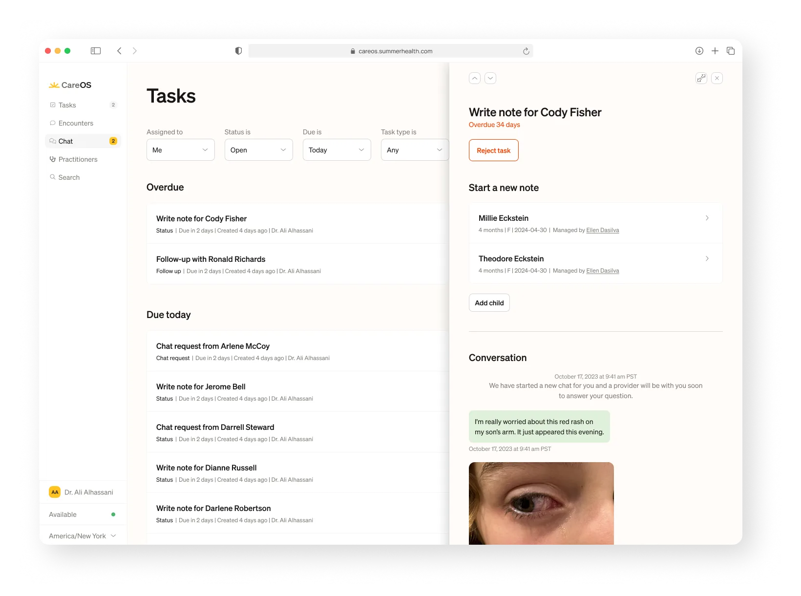
My research approach with providers was different from the structured 1:1 calls I ran with parents. Clinicians didn't need interview protocols. They needed someone who would sit with them, informally and regularly, while they used the tool and watch where things broke. We also ran collaborative FigJam sessions, mapping workflows together and identifying where the friction lived.
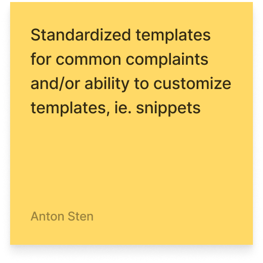
The feedback was direct. One provider told me they loved the auto-populate note because it made documentation so much easier. That was about a feature we'd already shipped. Another said they valued that it was mobile optimized and had AI-generated notes — validating two deliberate design decisions in a single sentence.
Designing for speed, clarity, and trust
CareOS doesn't need to be warm. It needs to be fast, clear, and reliable.
That distinction drove every design decision. Where the Care App prioritizes emotional reassurance and human connection, CareOS prioritizes efficiency and confidence. A clinician scanning twenty active cases needs to orient instantly, decide quickly, and act without doubt.
The design language reflects this: high-contrast typography for fast readability. Compact spacing without clutter. Clear CTAs that leave no room for hesitation. Desktop optimized for complexity: managing multiple cases, writing detailed notes, reviewing history. Mobile optimized for speed: a parent just sent a photo, a case needs a fast response, a follow-up is due.
The layout borrows from Notion's board-and-detail pattern: a persistent overview for orientation on the left, and a single-purpose detail panel on the right. Designed to let clinicians scan, decide, and act without collapsing their mental model.


AI that's visible
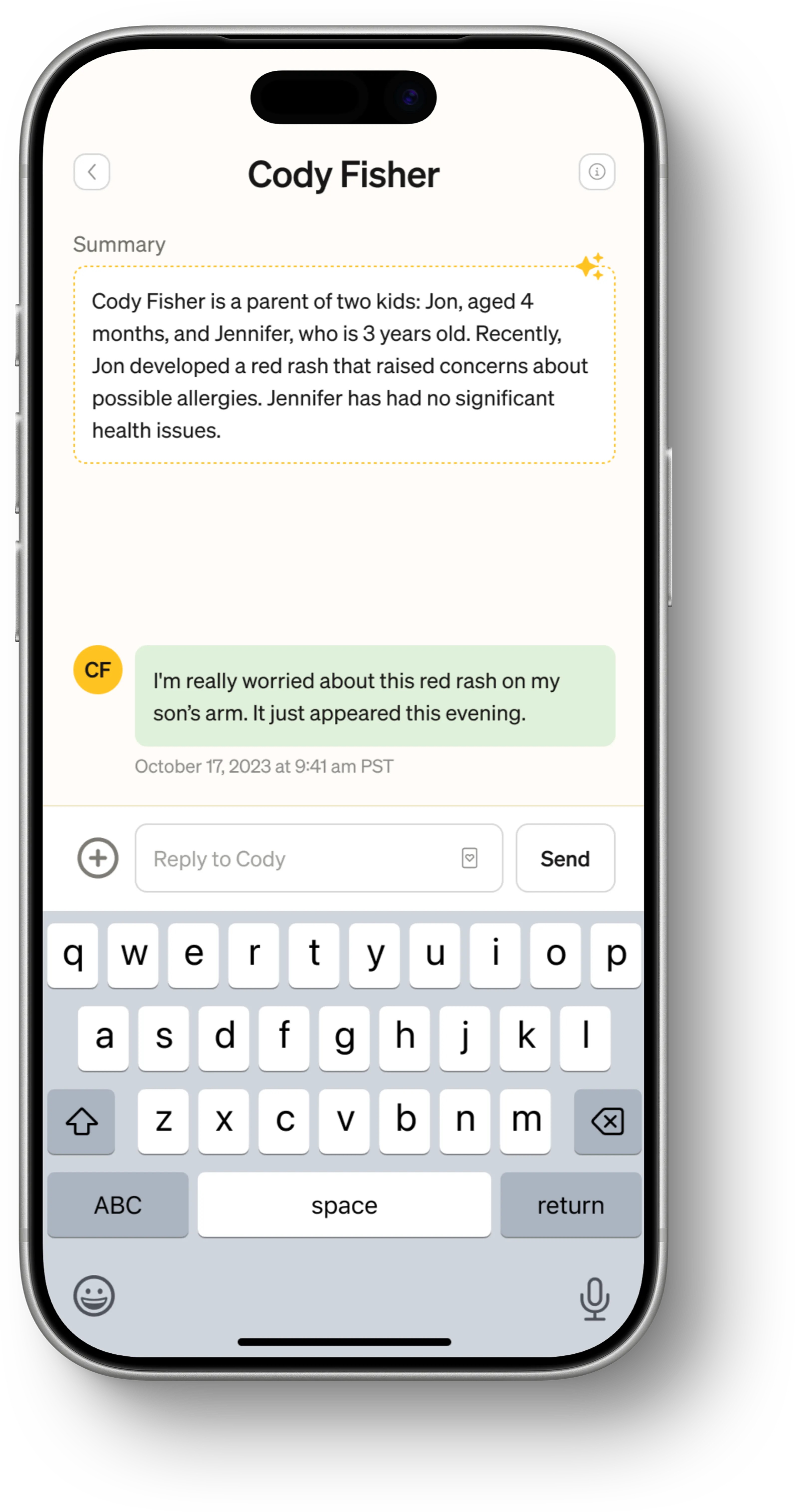
The same product runs AI in two opposite directions. In the Care App, AI works invisibly behind the scenes — parents never see it. In CareOS, AI tools sit directly in front of clinicians. They can see the AI-generated notes. They confirm them. They understand what the system is suggesting and why.
This distinction was deliberate. Parents need to trust the human on the other end. Clinicians need to trust the tool in front of them, and trust requires transparency. A clinician who can see how an AI note was generated, and can correct it, will trust it. A clinician who gets a black-box output won't.
The AI documentation tools handle the mechanical parts of clinical work: assembling notes from conversation context, suggesting ICD codes, flagging follow-up items. This lets clinicians focus on the parts that require their expertise. The goal was to bring the human part of pediatrics back to the center, while removing the administrative nightmare that healthcare has become.

Outcomes
- Documentation time reduced to approximately one hour compared to the days-long process clinicians were used to on other EHR platforms.
- A clinical tool that clinicians actually chose to use. Not because they had to, but because it made their work better.
The parent's side
CareOS is the engine. But everything it powers exists to serve one moment: a parent, worried about their child, reaching for their phone. That's the Care App story.