Working backwards
· 5 min read
This weekend I visited a friend who studies at an art school. She showed me around the studios, walls covered in figure drawings, still lifes, and portrait studies in various stages of completion. It brought back memories from my own school years. I studied at Hyper Island 25 years ago, back when the program was called New Media Design, believe it or not. Different school, different medium, but the same feeling of a place where people are there to learn how to see.
Because on paper, what she does and what I do have little in common. Design solves a problem. There’s a user, a constraint, a business goal, someone waiting on the other end who needs to accomplish something. Art carries no such obligation. Donald Judd said it best in seven words:
“Design has to work. Art does not.”
— Donald Judd
That difference shapes everything. When I design something, my taste is in service of someone else’s outcome. When my friend paints, the outcome is the painting. Neither is harder or nobler than the other, but they are different jobs. Still, the longer I walked around, the more I noticed how much of her training would make anyone a better designer.
The habits on the wall
In one of the rooms, someone had taped up a printout titled “Good Habits.” Four items: step back to look at your work from a distance, use a mirror or flip your piece upside down, squint to see the big shapes, take a break and clear your mind.
That’s painting advice. It’s also a better summary of senior design behavior than most things I’ve read in design books. Understanding the big picture is often what separates senior designers from junior ones. Juniors polish the component in front of them. Seniors step back and ask whether the screen makes sense in the flow, whether the flow makes sense in the product, whether the product makes sense at all.
And squinting has a direct design equivalent. In my book I write about the one-handed test, which came out of my work at Summer Health. A parent booking a doctor’s appointment usually has one hand free because the other one is holding their child, and their focus is split at best. Squinting at a painting and using an app while bouncing a feverish kid do the same thing: they strip away the details and reveal whether the big shapes hold up. If the hierarchy only works for a calm person with two hands and full attention, it doesn’t work.
Next to the habits hung another printout: “Focus Glasses.” Alignments, angles, measurements, implied lines. Ways of looking, each one training your eye on a specific relationship within the work. This is the essence of craft, and honestly, it’s the skill I fear is going missing as more people design things through prompts. The tools will catch up on some of it. I already use a couple of skills in Claude Code to check that font sizes hold a sensible ratio, that spacing follows a scale. But a tool that checks ratios can’t tell you what to look for when something feels off and the checklist comes back clean. That still takes a trained eye.
David Hoang wrote about this recently in a piece called Training design senses. His argument is that taste and judgment don’t arrive with a job title, they get built through deliberate practice, the way a musician or boxer trains. His first year of art school allowed no color: charcoal, still lifes, figure drawing, and copying the old masters. His advice for interface designers is to do the equivalent. Put a great screen on your canvas and rebuild it from scratch, noting the margins, the spacing, the type sizes, and asking why each decision works. He also passes along a line from a colleague that stuck with me: someone can have twenty years of experience at the same skill level.
Deconstructing the finished piece
The thing that struck me most came at the end of the visit. My friend told me about an exercise where they take a finished painting and deconstruct it. They start with the final piece and step backwards through it, layer by layer, to understand how the result was actually achieved. The image below shows what that looks like in practice: the same composition as a sketch, as an underpainting, and as the finished piece, side by side on the wall.
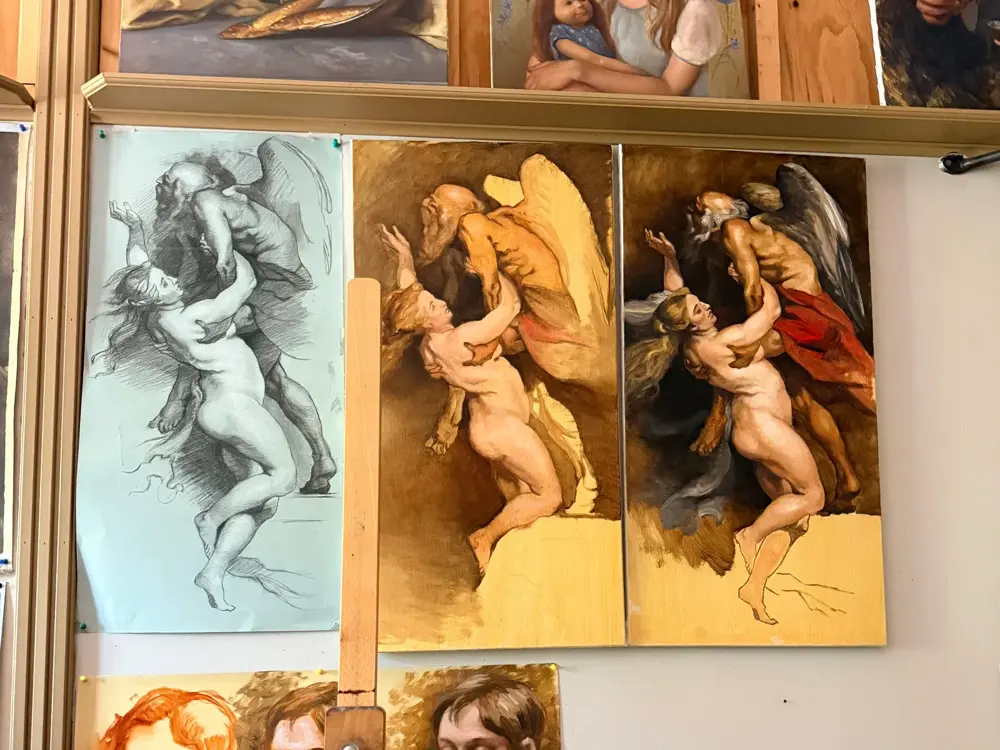
Samuel Hulick did something like this for products years ago. His site UserOnboard broke down onboarding flows screen by screen, annotating what worked and what didn’t, and it’s still online. At the time it felt like a clever content format. Walking through that studio, I realized it was the same exercise the art students do: take a finished thing and walk backwards until you understand how it was built.
I wonder if we need more of this now, not less. We’ve reached a point where an idea becomes a prompt and a prompt becomes an app in the store in days. The finished result appears almost instantly, and nobody steps backwards through anything. Meanwhile these students spend weeks deconstructing a single painting to understand its structure. One of those groups is building the judgment to know why something works. I’m not sure it’s the faster one.