· 6 min read
Designing less to learn more
One of the funny things about process is how confidently it’s packaged. The design sprint, for instance, comes with instructions precise enough to seem like a recipe. But anyone who’s cooked knows recipes don’t always account for the quirks of your kitchen — or your guests.
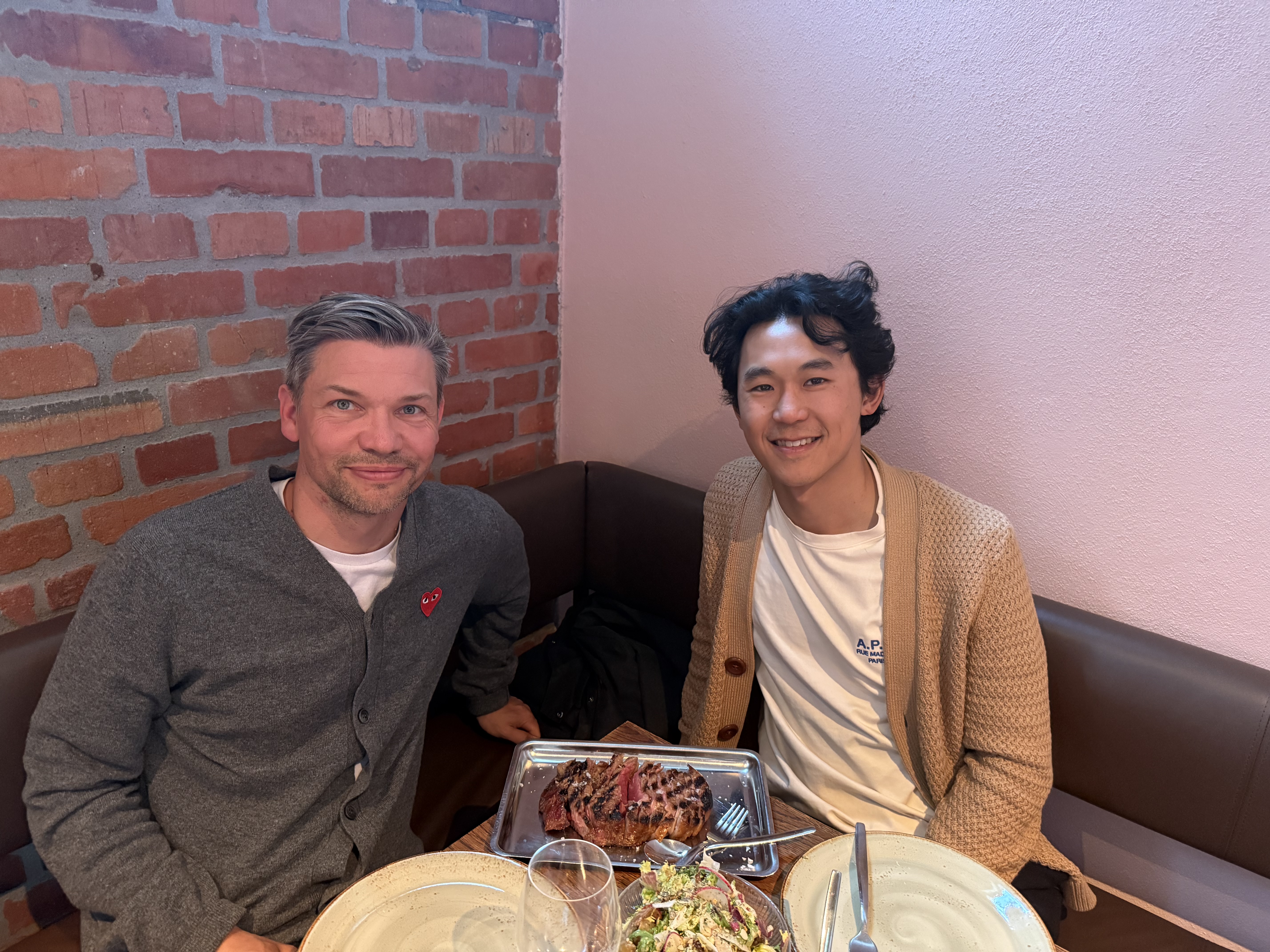
Last week, I hosted Matthew, co-founder at Summer Health, at my home in the Swedish countryside. We’d both done the classic design sprint before — the kind with sticky notes, a strict five-day schedule, and a timer ticking like it’s a game show. Ours happened last fall in San Francisco. And while it followed the rules, the outcome felt fuzzy. We came out of it with more questions than prototypes. That might be fine if your goal is to learn, but we weren’t even sure what we’d learned.
So this time we threw out the recipe.
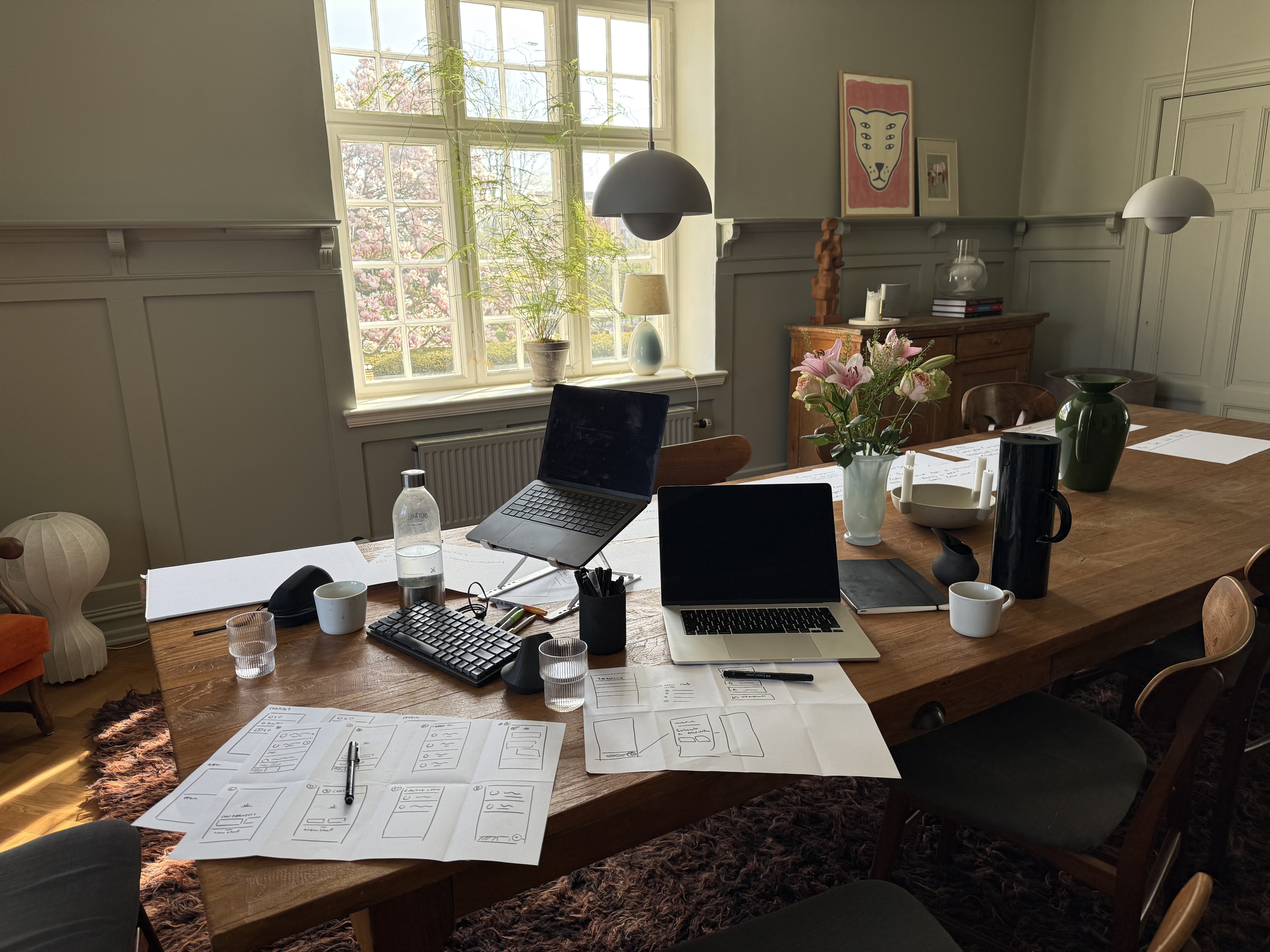
Instead of trying to compress understanding, ideation, and feedback into a single frantic week, we did something slower. Two weeks before Matthew arrived, we started interviewing users — not in the abstract, but real people navigating Medicaid, which is who Summer Health serves. We didn’t ask what features they wanted. We asked about their lives. What they struggled with. How they actually solved problems. By the time we got to building, the question wasn’t what to build. It was how simply could we build it.
We used Replit to make basic, interactive prototypes. Not “high-fidelity.” Not pixel-perfect. Just enough to show the shape of an idea. And then we gave them to users to play with — asked questions - and tweaked our prototypes. The prototypes grew alongside the feedback.
Some surprising things happened
First, even when you tell people to ignore the design, they don’t. A semi-polished interface makes them think it’s final. Ironically, our ugliest prototypes worked best — the roughness made people feel like their feedback could still change something.
Second, people are more honest than we expect. If a feature felt useless, they said so. If something clicked, you could hear it in their voice. The feedback was clearer because the whole setup was more human.
In a week, we built and tested three different prototypes. But more importantly, we came out with a plan that feels alive — one that’ll keep changing with real use.
I don’t think we reinvented the design sprint. We just made it fit our context. We slowed it down, gave users more room to speak, and treated the week not as a finish line but as a starting point. It turns out you can move fast and take your time — if you’re willing to rewrite the rules.
We still had time for great meals — which, come to think of it, might’ve been part of the process.